Hình ảnh & Video
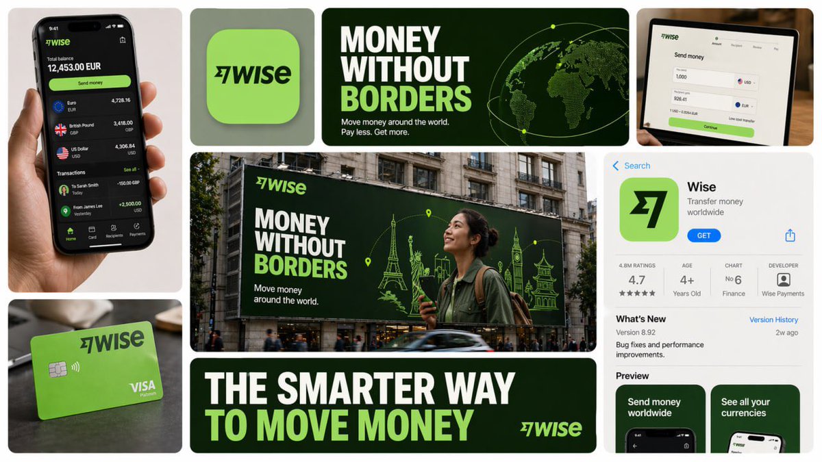
Bìa thương hiệu đa thương hiệu 16:9
Bố cục bìa thương hiệu đa thương hiệu 16:9 với các ô hình vuông tròn, khoảng cách đều, sắp xếp sạch sẽ và nền màu trung tính nhẹ. Thiết kế phải giữ nguyên hình dạng nhưng nội dung bên trong mỗi ô phả…
H
Hưng
06/06/2026
25 views
Nội dung Prompt
Create a 16:9 horizontal bento-grid brand collage for [BRAND NAME] in a polished contemporary campaign style. Use a fixed 3-row, 4-column bento structure with rounded tiles, equal gaps, clean alignment, and a light neutral background. The layout must stay consistent across generations, but the content inside each tile must adapt to the real business model, product ecosystem, and brand language of [brand name]. Grid blueprint Build the composition as 11 visible content zones arranged in a fixed bento layout: Top-left tile: 1 column × 2 rows, tall vertical hero device or primary brand surface Top-middle-left tile: 1 column × 1 row, compact square brand asset tile Top-middle-right tile: 2 columns × 1 row, wide headline/message tile Center tile: 2 columns × 2 rows, dominant campaign hero scene Top-right tile: 1 column × 1 row, secondary device / product surface / branded object Bottom-left tile: 1 column × 1 row, product artifact or branded utility object Bottom-center tile: 2 columns × 1 row, large bold typography tile Bottom-right tile: 1 column × 2 rows, tall informational product / interface / feature tile All tiles must share the same corner radius, spacing system, and visual polish. The dominant focal points are the large center hero tile, the wide top headline tile, and the wide bottom typography tile. Adaptive content logic Do not assume [brand name] is a fintech brand. Before deciding what appears inside each tile, infer what [brand name] actually is: social platform, SaaS tool, media brand, retailer, hospitality brand, hardware company, mobility app, AI product, consumer app, etc. Every tile must contain a plausible branded asset based on that business type. Use this rule: If [brand name] has a real consumer app, dashboard, product UI, creator interface, booking flow, editor, storefront, feed, player, workspace, or operating surface, use those. If [brand name] does not realistically have payment cards, watches, or hardware, do not invent them. Only include branded physical objects when they make sense for the brand: packaging, merch, signage, magazine, laptop sticker, storefront card, delivery box, product box, wearable, poster, notebook, tote, badge, ticket, book, etc. If the brand is primarily digital, prioritize screens, interface fragments, campaign graphics, app/store listings, editorial visuals, and branded communication assets. If the brand is a platform, use realistic platform surfaces: profile screens, creator dashboards, boards, playlists, templates, analytics, publishing tools, discovery feeds, search, collaboration views, etc. If the brand is a physical-product company, use realistic product shots, packaging, product detail pages, retail signage, and lifestyle scenes. If the brand is a service business, use realistic booking, scheduling, marketplace, onboarding, testimonial, results, or service-delivery interfaces. If exact assets are unknown, infer the most believable official-looking product and campaign system for [brand name]. Tile-by-tile rules 1) Tall left hero tile Show the most iconic primary branded surface for [brand name]. Examples: phone with app UI laptop with dashboard/editor tablet with creative workspace product packaging held in hand branded poster or printed object storefront or physical product close-up This tile should represent the brand’s main touchpoint, not a generic device. 2) Small square brand asset tile Show a compact brand-signature element: app icon logo mark symbol product badge branded motif miniature packaging unit icon system object sticker or seal simplified 3D brand emblem This tile should feel like a distilled identity marker. 3) Wide top headline tile Use a short strategic message that fits [brand name]’s category and tone. Do not repeat generic fintech copy. The line should feel like a real campaign headline for that specific brand. Examples of direction: discovery creativity organization inspiration connection travel productivity expression streaming collaboration automation Use large, bold, high-contrast typography. 4) Large center hero tile Create the main campaign scene for [brand name] in a real-world or branded-environment context. This should be the most expressive tile. Possible formats: outdoor billboard subway poster retail installation city poster wall laptop-on-desk hero scene creator workspace product-in-use lifestyle shot editorial campaign image interface projected into environment branded event signage The scene must make sense for the brand’s world and audience. 5) Top-right support tile Show a secondary but still realistic brand surface: another device view product detail branded object campaign variation interface zoom-in packaging angle social post mockup desktop widget creator tool panel notification / discovery / search view This tile should complement the main touchpoint, not duplicate it exactly. 6) Bottom-left artifact tile Show a category-appropriate branded artifact, not a fixed “bank card”. Choose the artifact based on [brand name]: for fintech: payment card, wallet pass, transfer screen, exchange card for social/media: creator card, profile card, post template, content preview, board tile, channel card for SaaS/productivity: workspace card, document preview, template card, dashboard widget for e-commerce/retail: packaging, shipping box, loyalty pass, product tag, order card for travel/hospitality: booking card, room key, boarding-style pass, itinerary card for music/media: album card, playlist card, player card, event ticket for AI/software: prompt card, generation result card, model card, workflow card This tile must feel like a believable branded unit of value for that company. 7) Wide bottom message tile Use one strong oversized statement in uppercase or bold display typography. This is not necessarily the slogan from the top tile; it can be a broader campaign line or category promise. The message must match the actual brand behavior of [brand name]. For example, do not use “MOVE MONEY WITHOUT BORDERS” unless the brand actually deals with payments or finance. 8) Tall right informational tile Show a structured branded information surface: app store page product page onboarding screen feature overview marketplace listing creator profile brand campaign landing screen dashboard overview editorial page discovery feed help center / setup / feature panel This tile should add product depth and make the collage feel like a full brand system. Brand realism rules Use the real or highly plausible brand identity of [brand name]: logo, color palette, typography feel, icon language, image treatment, interface style, and tone of voice. If exact assets are unavailable, invent only what is necessary, but make it feel like the official visual system of [brand name]. Do not force a product category onto the brand. Do not invent impossible hardware, payment tools, packaging, or app features unless they are realistic adjacent extensions of the brand. Prefer believable brand adaptation over visual symmetry. Visual consistency rules Even though tile content is adaptive, the final image must still feel like one campaign system: same overall grid structure same tile spacing same corner radius same art direction quality same brand palette across all tiles consistent typography logic consistent mockup realism consistent lighting and polish Style Clean premium brand presentation, high detail, polished mockup realism, soft shadows, strong hierarchy, editorial-quality composition, modern campaign aesthetics. Avoid random collage chaos. Avoid tiny unreadable text. Avoid generic placeholder UI. Keep the structure fixed, but let the objects and branded surfaces adapt intelligently to [brand name]. Stronger one-line instruction Important: the layout is fixed, but the objects are not fixed. For each generation, select tile content based on what [brand name] realistically sells, ships, publishes, displays, or lets users interact with. Never insert category-inappropriate objects just to fill the grid.
Chia sẻ prompt này:
Có thể bạn quan tâm
Hình ảnh & Video
Tạo ảnh minh họa 3D một tế bào sinh học với các bộ phận chi tiết.

Hình ảnh & Video
Poster quảng cáo nước khoáng cao cấp với mẫu nam trẻ mặc linen trắng vàng, đứng bên chai nước tinh khiết khổng lồ phủ sương, phông trắng tinh khiết và xanh lá, chữ nổi bật và hiệu ứng sương nhẹ, phù…

Hình ảnh & Video
Poster anime cao cấp với hình ảnh anh hùng nổi lên từ sóng giấy và mây xoáy, thiết kế hộp giấy đa lớp, thiết kế giấy thủ công tinh tế, nghệ thuật cắt giấy sâu, giấy cardstock có độ sâu và độ nét cao,…