Hình ảnh & Video
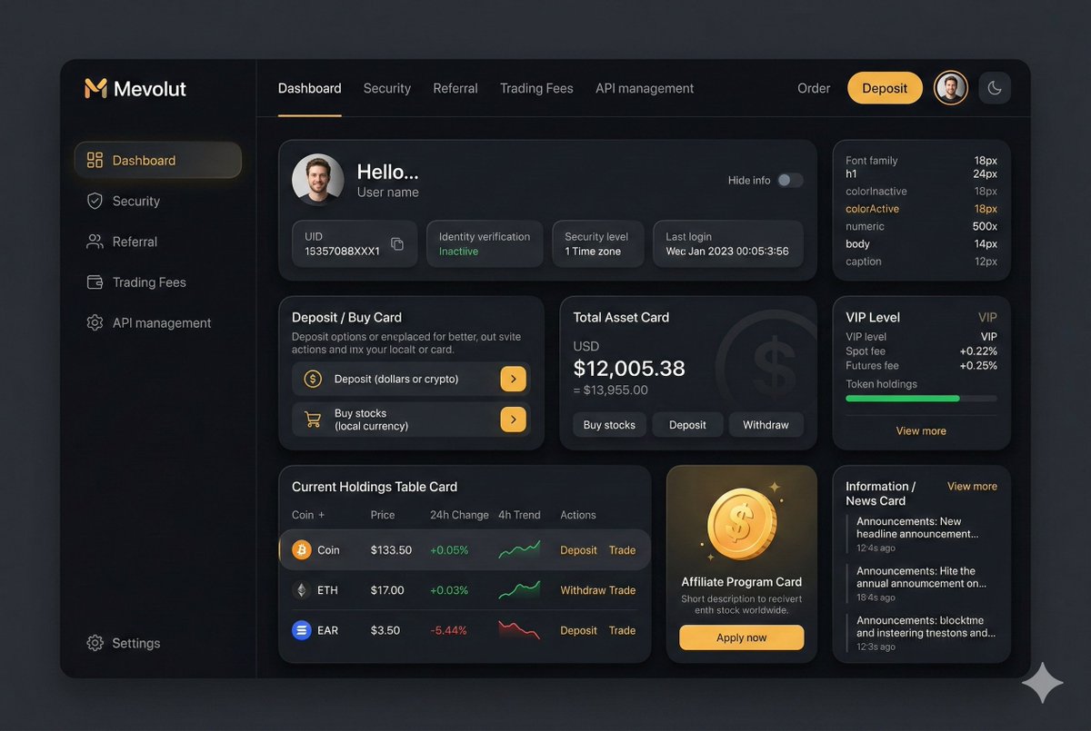
Mockup giao diện fintech cao cấp
Giao diện dashboard fintech cao cấp với màu tối, ngôn ngữ hình ảnh mềm mại, bóng tối và màu sắc nhẹ nhàng, phù hợp cho các nhà đầu tư chuyên nghiệp.
H
Hưng
06/06/2026
41 views
Nội dung Prompt
You are an experienced UI designer embracing modern, minimalistic design, shadows, glass, and soft colors. Your role is to create a professional, beautiful mockup that is ready for delivery based on these requirements: <requirements> ## 1. Overall Style & Visual Language This interface represents a premium, modern fintech / crypto trading dashboard using a dark theme. The visual language combines **soft neumorphism**, and **luxury Web3 aesthetics**. Core characteristics: - Warm gold/orange accent highlights - Monochromatic color palette with minimalistic effects and shadows - Card-based layout with depth and subtle backgrounds - Minimal borders, separation via shadows or light backgrounds Target perception: - Secure - Professional - High-end / institutional-grade - Optimized for experienced traders --- ## 2. Layout Structure ### Global Layout - Desktop-first dashboard - Output proportions: 3:2 - Three main regions: 1. Top navigation bar (horizontal) 2. Left sidebar navigation (vertical) 3. Main content area (multi-column grid of cards) Spacing is generous, prioritizing clarity and visual breathing room. --- ## 3. Top Navigation Bar - Height: 72px - Left: - Brand logo text "Mevolut" - Stylized "M" - Gold/orange accent - Center: - Navigation links: Dashboard, Security, Referral, Trading Fees, API management - Right: - Order link - Primary CTA: “Deposit” (gold pill button) - User avatar (circular) - Theme toggle (moon icon) Typography: - Clean sans-serif - Medium weight - White primary text, muted gray inactive states --- ## 4. Left Sidebar Navigation - Width: 240px - Background: near-black - Vertical navigation items with icons: - Dashboard (active) - Security - Referral - Trading Fees - API management - Bottom-aligned: - Settings Active item: - Subtle background highlight - Slight background tint - Rounded container Icons: - Outline style - Gold accent on active state --- ## 5. Main Content Area ### 5.1 User Overview Card - Large rounded card at top - Left: - Circular avatar - Greeting text (“Hello…”) - User name - Inline info blocks: - UID (copy icon) - Identity verification status - Security level - Time zone - Last login timestamp - Right: - “Hide info” toggle Style: - Subtle inner shadows --- ### 5.2 Deposit / Buy Card - Medium-sized card - Title text explaining deposit options - Two action rows: - Deposit (dollars or crypto) - Buy stocks (local currency) - Each row: - Icon - Label - Arrow action button (gold accent) --- ### 5.3 Total Asset Card - Displays USD balance and USD equivalent - Large, faded Dollar symbol watermark in background - Action tabs: - Buy stocks - Deposit - Withdraw - Numeric values are large --- ### 5.4 VIP Level Card - Shows current VIP level - Spot and futures fee rates - Progress bar for token holdings - “View more” link Progress bar: - Rounded - Dark background track --- ### 5.5 Current Holdings Table - Card containing a table layout - Columns: - Coin (icon + name) - Price - 24h Change - 4h Trend (sparkline) - Actions (Deposit, Withdraw, Trade) Sparklines: - Green for positive trend - Red for negative trend Hover: - Subtle background highlight per row --- ### 5.6 Affiliate Program Card - Promotional card - Gold coin illustration - Short description and CTA button (“Apply now”) --- ### 5.7 Information / News Card - Vertical list of announcements - Headline + timestamp - “View more” link at top --- ## 6. Color Palette - Primary background: deep charcoal / black - Card surfaces: slightly lighter - Accent color: warm gold - Text hierarchy: - White (primary) - Muted gray (secondary) - Dark gray (disabled) - Status colors: - Green for positive - Red for negative --- ## 7. Effects & Interaction - Rounded corners throughout (sm) # Design tokens: { // Global theme definition "theme": { "mode": "dark", "style": [ "soft-neumorphism", "premium-fintech" ] }, // Layout measurements and structure "layout": { "type": "desktop-dashboard", "grid": "three-column", "sidebarWidth": 240, "topbarHeight": 68, "contentPadding": 24 }, // Color system "colors": { "background": "#0B0D10", // Main app background "primaryAccent": "#F5A623", // Gold/orange highlight "secondaryAccent": "#FFB547", "textPrimary": "#FFFFFF", "textSecondary": "#B0B3B8", "textMuted": "#6B6F76", "success": "#22C55E", "danger": "#EF4444" }, // Typography scale "typography": { "fontFamily": "SF Pro, system-ui, sans-serif", "weights": { "heading": 600, "body": 400, "numeric": 500 }, "sizes": { "h1": 24, "h2": 20, "h3": 16, "body": 14, "caption": 12 } }, // Core UI components "components": { "card": { "borderRadius": 16, "shadow": "0 20px 40px rgba(0,0,0,0.4)", "border": "none", "background": "#14171C", }, "button": { "primary": { "textColor": "#0B0D10", "borderRadius": 999, }, "secondary": { "background": "transparent", "textColor": "#F5A623" } }, "sidebar": { "background": "#0E1014", "itemRadius": 12, "iconStyle": "outline" }, "table": { "rowHeight": 56, "divider": "subtle", "hoverHighlight": true, "sparkline": { "positiveColor": "#22C55E", "negativeColor": "#EF4444" } }, "progressBar": { "height": 6, "radius": 999, "fillColor": "#22C55E", "backgroundColor": "#2A2E35" } }, // Icon system "icons": { "style": "outline", "size": 18, "colorInactive": "#6B6F76", "colorActive": "#F5A623" } } </requirements>
Chia sẻ prompt này:
Có thể bạn quan tâm
Hình ảnh & Video
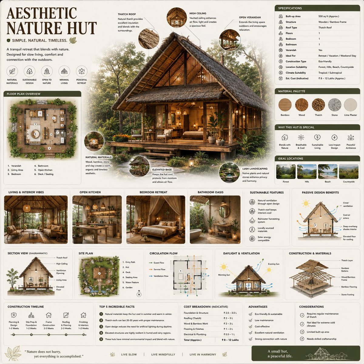
Infographic kiến trúc sinh thái cao cấp với bố cục hình vuông, phối màu ấm và chi tiết lều gỗ, phù hợp cho sách hướng dẫn thiết kế bền vững.
Hình ảnh & Video
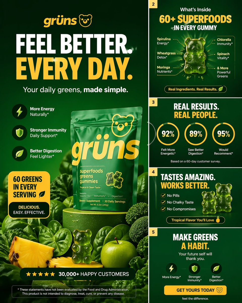
Bố cục hình ảnh carousel cao cấp cho Grüns, với hook nổi bật, kết quả rõ ràng và thiết kế DTC cao cấp. Phù hợp cho thiết kế di động.
Hình ảnh & Video
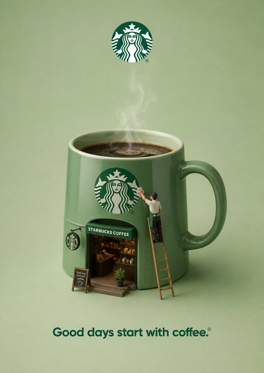
Thiết kế quảng cáo 3D với vật thể siêu thực từ thương hiệu, bố cục tối giản, người nhỏ tương tác, phù hợp chiến dịch sáng tạo.